목요일, 4월 30, 2009
[MSDN 개발자 뉴우스 8] VSTS 2010 스터디모임
제가 참여 하고 있는 VSTS2010 스터디 모임 인터뷰가 MSDN 팝콘에 떴습니다.
Visual Studio Team System 2010에서 제공할 신기능들과 .NET Framework 4의 새로운 특징들을 공부하고 블로그를 통해 다른 개발자들에게 어디서도 얻을 수 없는 정보를 공유하고 있습니다.
아직 베타도 나오지 않은 VSTS2010이지만 열심히 자료를 모으고 정보를 공유 하고 있으니 블로그 많이 들러주시기 바랍니다.
영상이 보이지 않으면 이곳을 클릭해서 실버라이트를 설치하세요
라벨: .NET, MSDN, Study, vsts2010
수요일, 4월 29, 2009
Windows 7을 위한 Windows XP 모드
Windows XP에서 Windows 7 환경으로 이행하려는 기업을 목적으로 개발했다고 하는데 일반 사용자에게도 많은 도움이 될 것 같습니다.

공개된 스크린샷을 보면 Windows 7 환경에서 XP 어플리케이션이 자연스럽게 구동되는것을 볼 수 있습니다. (에어로 테마가 아닌 XP의 루나 테마로 확인 할 수 있습니다.)
Windows Virtual PC의 Windows XP 환경에서 가상으로 동작하게 되며 호환성 문제의 고민을 해결합니다. 현재 아직 공개되지는 않았고 조만간 베타버전이 선보인다고 하는데 이후에 자세한 내용을 알아보도록 하겠습니다.
현재 공개된 정보는 아래 링크에서 자세히 확인 할 수 있습니다.
Windows XP Mode for Windows 7 Screens
Revealing Windows XP Mode for Windows 7
라벨: 가상화, 윈도우 7, 윈도우 XP, Study, virtual pc, windows 7, windows xp, XPM
목요일, 4월 23, 2009
WPF Features Preview (3) - Styling the DataGrid
WPF Features Preview (1) - DataGrid
WPF Features Preview (2) - DatePicker
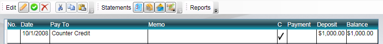
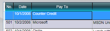
맨 처음 초기 어플리케이션을 보면 스타일이 적용되어 멋지게 보입니다. DataGrid를 적용하여 수정된 버전은 좀 더 기능적이긴 하지만 밋밋하고 보기엔 좀...
이번에는 DataGrid에 스타일을 주어서 컬러풀하고 비주얼적으로 멋지게 만들어 보도록 하겠습니다.
프로젝트를 열고 MainWindow.xaml 파일을 열어서 DockPanel 부분을 보면 뭔가 스타일이 적용된것을 볼 수 있습니다. 이 중에서 몇가지 brush와 GridViewColumnHeader와 ListViewItem 스타일을 DataGrid 스타일에 적용해 보도록 하겠습니다.
DataGrid의 스타일 프로퍼티
1. CellStyle - 각각의 cell에 사용되는 스타일 (DataGridCell)
2. RowStyle - row에 사용되는 스타일 (DataGridRow)
3. ColumnHeaderStyle - header bar에 사용되는 스타일 (DataGridColumnHeader)
사용자가 grid와 상호작용하는 것에 대한 프로퍼티
1. SelectionMode - 단일선택과 확장된 선택에 대한 모드
2. SelectionUnit - 무엇이 선택되는가에 대한 설정 (FullRow vs Cell vs CellOrRowHeader)
3. GridLinesVisibility - cell 주변의 라인에 대한 속성
4. VerticalGridLinesBrush - 수직 라인에 대한 색상
5. HorizontalGridLinesBrush - 수평 라인에 대한 색상
먼저 TargetType으로 스타일이 적용될 타입에 대해 설정해줍니다.
TargetType 값에 GridViewColumnHeader를 dg:DataGridColumnHeader로 바꿔줍니다.
그리고 ListViewItem도 dg:DataGridRow로 바꿔줍니다.
변경된 xaml 코드는 아래와 같습니다.
<Style x:Key="dgHeaderStyle" TargetType="dg:DataGridColumnHeader">
<Setter Property="Background" Value="{StaticResource dgHeaderBrush}" />
<Setter Property="Foreground" Value="White" />
<Setter Property="BorderBrush" Value="{StaticResource dgHeaderBorderBrush}" />
</Style>
<Style x:Key="dgRowStyle" TargetType="dg:DataGridRow">
<Setter Property="SnapsToDevicePixels" Value="True" />
<Setter Property="Background" Value="White" />
<Style.Triggers>
<Trigger Property="ItemsControl.AlternationIndex" Value="1">
<Setter Property="Background" Value="#FFD0D0E0" />
</Trigger>
<Trigger Property="IsSelected" Value="True">
<Setter Property="Background" Value="LightGoldenrodYellow" />
</Trigger>
</Style.Triggers>
</Style>
DataGrid가 정의된 곳에는 ColumnHeaderStyle과 RowStyle 속성을 설정해줍니다.
<dg:DataGrid x:Name="dg" ItemsSource="{Binding}" Margin="10"
AutoGenerateColumns="False"
Background="#80909090" AlternationCount="2"
ColumnHeaderStyle="{StaticResource dgHeaderStyle}"
RowStyle="{StaticResource dgRowStyle}">
이제 어플리케이션을 실행해보면 스타일이 적용되어 이전과 다른 모습을 볼 수 있습니다.
이제 몇가지 grid에 대한 속성을 주도록 하겠습니다.
1. Extended 선택 모드 적용
2. SelecionUnit을 FullRow로 설정
3. GridLinesVisibility를 All로 설정
4. VerticalGridLinesBrush를 DarkGray로 설정
<dg:DataGrid x:Name="dg" ItemsSource="{Binding}" Margin="10"
AutoGenerateColumns="False"
Background="#80909090" AlternationCount="2"
ColumnHeaderStyle="{StaticResource dgHeaderStyle}"
RowStyle="{StaticResource dgRowStyle}"
SelectionMode="Extended"
SelectionUnit="FullRow"
GridLinesVisibility="All"
VerticalGridLinesBrush="DarkGray">
또 몇가지 설정을 해서 header 스타일을 주도록 해보겠습니다.
1. BorderTickness를 1로 주어서 border를 볼 수 있도록
2. pixel snapping을 활성화 (SnapsToDevicePixels="True")
3. 컨텐트 horizontal 정렬 (HorizontalContentAlignment="Center")
4. MinWidth="0" MinHeight="30" 으로 설정
5. 기본 커서 모양을 Hand로 설정
<Style x:Key="dgHeaderStyle" TargetType="dg:DataGridColumnHeader">
<Setter Property="Background" Value="{StaticResource dgHeaderBrush}" />
<Setter Property="Foreground" Value="White" />
<Setter Property="BorderBrush" Value="{StaticResource dgHeaderBorderBrush}" />
<Setter Property="BorderThickness" Value="1" />
<Setter Property="SnapsToDevicePixels" Value="True" />
<Setter Property="HorizontalContentAlignment" Value="Center" />
<Setter Property="MinWidth" Value="0" />
<Setter Property="MinHeight" Value="30" />
<Setter Property="Cursor" Value="Hand" />
</Style>
다시 컴파일해서 실행해보면 좀 더 직관적으로 보기 쉽게 스타일 적용이 된 것을 볼 수 있습니다.
다음으로는 Cell 자체에 대한 스타일 적용을 해보겠습니다. Cell의 컨텐트가 가운데로 오고 필요할 때 포커스가 적용되면 좀 더 편리할 것 같은데 이것을 해보도록 하겠습니다.

새로운 스타일 속성을 DockPanel.Resources에 추가하도록 합니다.
1. TargetType을 dg:DataGridCell로 설정
2. 중요한 속성은 기본 DataGridCell을 따르기 위해 BasedOn 프로퍼티 설정
"{StaticResource{x:Type dg:DataGridCell}}"
3. SnapsToDevicePixels를 "True"로 설정
4. VerticalAlignment를 "Center"로 설정
5. Trigger 컬렉션 추가 - 셀이 선택되었을 때 background/foreground 색상 변경
6. <Style.Triggers> 부분에 IsSelected 프로퍼티를 True로 설정하고
a. Background를 Transparent로
b. BorderBrush를 Transparent로
c. Foreground를 Black으로
7. 두번째 trigger를 추가하고 IsKeyboardFocusWithin="True" 프로퍼티에
a. Background에 "{StaticResource whiteBackBrush}" 리소스
b. BorderBrush에 "{DynamicResource{x:Static dg:DataGrid.FocusBorderBrushKey}}" 리소스
c. Foreground에 Black
<Style x:Key="dgCellStyle" TargetType="dg:DataGridCell"
BasedOn="{StaticResource {x:Type dg:DataGridCell}}">
<Setter Property="SnapsToDevicePixels" Value="True" />
<Setter Property="VerticalAlignment" Value="Center" />
<Style.Triggers>
<Trigger Property="IsSelected" Value="True">
<Setter Property="Background" Value="Transparent" />
<Setter Property="BorderBrush" Value="Transparent" />
<Setter Property="Foreground" Value="Black" />
</Trigger>
<Trigger Property="IsKeyboardFocusWithin" Value="True">
<Setter Property="Background" Value="{StaticResource whiteBackBrush}" />
<Setter Property="BorderBrush"
Value="{DynamicResource {x:Static dg:DataGrid.FocusBorderBrushKey}}" />
<Setter Property="Foreground" Value="Black" />
</Trigger>
</Style.Triggers>
</Style>
그리고 DataGrid 속성에 CellStyle 프로퍼티값을 줍니다.
<dg:DataGrid x:Name="dg" ItemsSource="{Binding}" Margin="10"
AutoGenerateColumns="False"
Background="#80909090" AlternationCount="2"
ColumnHeaderStyle="{StaticResource dgHeaderStyle}"
RowStyle="{StaticResource dgRowStyle}"
CellStyle="{StaticResource dgCellStyle}"
SelectionMode="Extended"
SelectionUnit="FullRow"
GridLinesVisibility="All"
VerticalGridLinesBrush="DarkGray">
이제 Cell을 클릭해보면 색이 적용되어 하이라이트 되는것을 볼 수 있습니다.

마지막으로 RowDetail 속성을 설정하도록 하겠는데 위에서 했던 방법과 비슷하니 자세한 설명은 생략하겠습니다. xaml 코드를 보면 어렵지 않게 이해 할 수 있을 것입니다.
<dg:DataGrid x:Name="dg" ItemsSource="{Binding}" Margin="10" ...
VerticalGridLinesBrush="DarkGray"
RowDetailsVisibilityMode="VisibleWhenSelected">
<dg:DataGrid.RowDetailsTemplate>
<DataTemplate>
<StackPanel Orientation="Horizontal" Margin="20,0,0,0">
<TextBlock />
<TextBox />
</StackPanel>
</DataTemplate>
</dg:DataGrid.RowDetailsTemplate>
TextBlock 속성
<StackPanel Orientation="Horizontal" Margin="20,0,0,0">
<TextBlock Text="Category:" VerticalAlignment="Center" FontWeight="Bold" />
<TextBox />
TextBox 생성
<dg:DataGrid.RowDetailsTemplate>
<DataTemplate>
<StackPanel Orientation="Horizontal" Margin="20,0,0,0">
<TextBlock Text="Category:" VerticalAlignment="Center" FontWeight="Bold" />
<TextBox Text="{Binding Category}" Margin="10,5" MinWidth="100">
<TextBox.Style>
<Style TargetType="TextBox">
<Setter Property="BorderBrush" Value="{x:Null}" />
<Setter Property="Background" Value="{x:Null}" />
<Style.Triggers>
<Trigger Property="IsFocused" Value="True">
<Setter Property="BorderBrush"
Value="{x:Static SystemColors.WindowFrameBrush}" />
<Setter Property="Background"
Value="{x:Static SystemColors.WindowBrush}" />
</Trigger>
<Trigger Property="IsMouseOver" Value="True">
<Setter Property="BorderBrush"
Value="{x:Static SystemColors.WindowFrameBrush}" />
<Setter Property="Background"
Value="{x:Static SystemColors.WindowBrush}" />
</Trigger>
</Style.Triggers>
</Style>
</TextBox.Style>
</TextBox>
</StackPanel>
</DataTemplate>
</dg:DataGrid.RowDetailsTemplate>
이제 모든 스타일 적용이 끝났습니다. 실행을 해보면 위에서 적용한 스타일이 적용되어 처음의 DataGrid보다 훨씬 보기도 좋고 스타일이 좋아진것을 알 수 있습니다.

지금까지 DataGrid에 대해 알아보았는데 다음에는 역시 새롭게 추가된 Ribbon 컨트롤에 대해 알아보겠습니다.
WPF에서도 기존의 메뉴와 툴바를 벗어나서 새로운 Ribbon 스타일을 적용할 수 있는데 이것 역시 어렵지 않게 할 수 있으니 기대해주세요.
 CheckbookManager.zip
라벨: 김태균, 스타일, DataGrid, Study, style, Visual Studio 2010, WPF, WPF4, WPFToolkit
에 가입 덧글 [Atom]
